The House Committee on Oversight and Reform Democrats maintains a dashboard tracking verified incidents of possible misconduct during federal immigration enforcement operations. It's an important resource—every incident is verified by reputable media outlets or referenced in federal court filings. No social media rumors. No unsubstantiated claims. Just documented facts.
There's just one problem: the dashboard itself is... functional. Barely.
It's a paginated table. No visualizations. No filtering beyond clicking through pages. No way to see patterns, trends, or geographic distribution at a glance. For data this important, we can do better.
So I did.
I built an interactive visualization layer on top of the Committee's data. Same verified incidents, same sources, same commitment to factual accuracy—but now you can actually explore it.
Explore the Dashboard →
What You Can Do With It
Filter and slice the data by date range, location, incident category, U.S. citizen involvement, or sensitive location enforcement (schools, churches, hospitals, courthouses).
Visualize patterns across multiple chart types:
- Category distribution showing the breakdown of incident types
- Monthly trends revealing how enforcement patterns change over time
- Cumulative timeline tracking the growing total
- Geographic distribution by state
- Sensitive location breakdown by venue type
Drill into details with expandable incident cards that link directly to the original source articles and court filings.
Export filtered data as CSV for your own analysis.
Switch themes because sometimes you're researching at 2 AM and dark mode really matters.
Report potential wrongdoing directly from the dashboard. If you see something, say something!
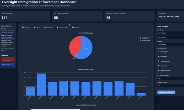
The Numbers (as of November 28, 2025)
- 314 verified incidents documented
- Date range: January 26 – November 20, 2025
- ~15% involve U.S. citizens
- ~16% occurred at sensitive locations
Every single data point links back to its source.
Transparency isn't optional here!
For Developers: This Is Open Source
The Entire Project is Available Now on GitHub. Contributions are welcome!
Go To The Repository
Tech Stack
Deliberately minimal:
- Pure HTML/CSS/JavaScript (no build step, no framework dependencies)
- Plotly.js for interactive charts
- CSS custom properties for theming
- Zero backend required—runs entirely client-side
Want to Contribute?
The repo includes a Python scraper (scripts/scrape_dashboard.py) that pulls fresh data from the source. No dependencies beyond the standard library. Run it, get JSON or JavaScript output, update the embedded data.
Areas where help would be welcome:
- Automated data updates — A GitHub Action that scrapes daily and opens a PR would keep the data fresh without manual intervention.
- Additional visualizations — Got ideas for charts that would reveal patterns I'm missing? The data structure supports it.
- Accessibility improvements — I've done the basics, but there's always room to make data visualizations more accessible.
- Mobile optimization — It's responsive, but complex filter panels on small screens could be smoother.
- Localization — Spanish language support would dramatically increase the utility for affected communities.
Fork it. Improve it. Send a PR.
Or just use it and share it with people who need it.
Why I Built This
I'm a language engineer and information architect. I've spent 30+ years building systems that help people make sense of complex information. This felt like an appropriate application of those skills.
The original data is valuable. The Committee staff did the hard work of verification. I just made it easier to understand.
If you're a journalist covering immigration enforcement, a legal aid organization, a researcher, or just a citizen trying to stay informed—I hope this helps.
Explore the Dashboard →
Have questions or suggestions? Find me on LinkedIn or open an issue on GitHub.